saving hawker colours
The plates
If you’ve eaten at an older hawker centre, you know the plates. Every stall has its own colour: red bowls for the mee soto uncle, green plates for the chicken rice auntie, some speckled pink thing for the char kway teow stall. Hawkers picked their colours so they could tell their crockery apart from the stall next door, and somewhere along the way it just became part of what a hawker centre looks like.
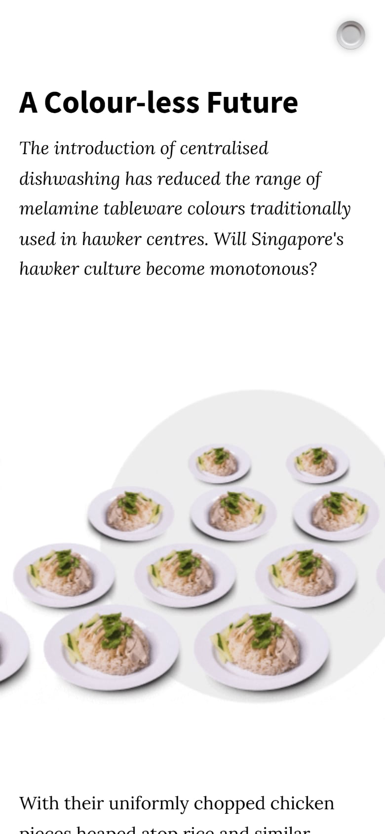
Then the newer hawker centres (the ones built from 2015) switched to centralised dishwashing. It solves a very real manpower problem, but it comes with standardised tableware in two or three colours: halal, non-halal and vegetarian. So the colours are slowly disappearing.
Which raised the question the whole project is built on: are these colours part of Singapore’s UNESCO-listed hawker culture? And do people actually link their food to a colour, or are we just being sentimental?
It started as Kwa Li Ying’s final-year project at the NUS Division of Industrial Design, and grew into a full research project led by her supervisor, Assoc Prof Hans Tan, with a DesignSingapore Council Good Design Research grant behind it. The plan was to ask Singapore directly, at scale. Which meant somebody had to build the thing.
How I ended up here
I came in with Kent under my internship at HansTan Studio for this massive undertaking. We were design students who had just learnt how to code, and we were very ambitious and very ignorant about what we were signing up for.
We made the prototype and got started, and pretty quickly realised the scope was waaay too big for us to figure out alone. So we were very thankful when Shaun Tung joined us. He was already a professional in the field, and he guided us through the whole process of turning a student prototype into something the public could actually use.
It was also the first time I touched React, coming from a pure vanilla JS background. And this survey went out back in the days when ChatGPT was really bad (GPT-3), so learning was manual: docs, forums, and breaking things until they worked. Very experimental, very fun, and incredibly painful .-.
Designing a survey people actually finish
Let’s be real, a survey about plate colours is the easiest thing on the internet to close. So the idea was to make it feel like a game rather than a form, and it ended up billed as a 15-minute play.
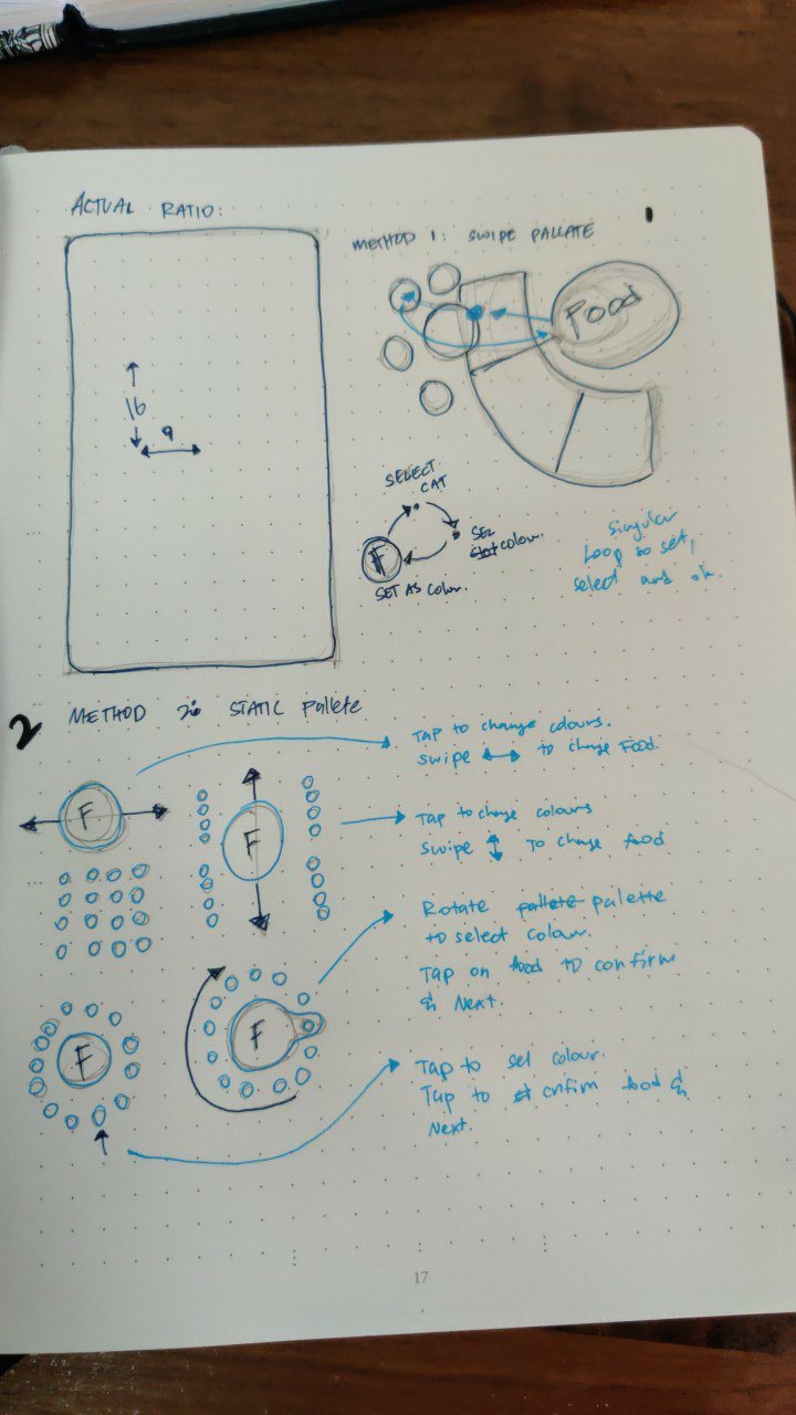
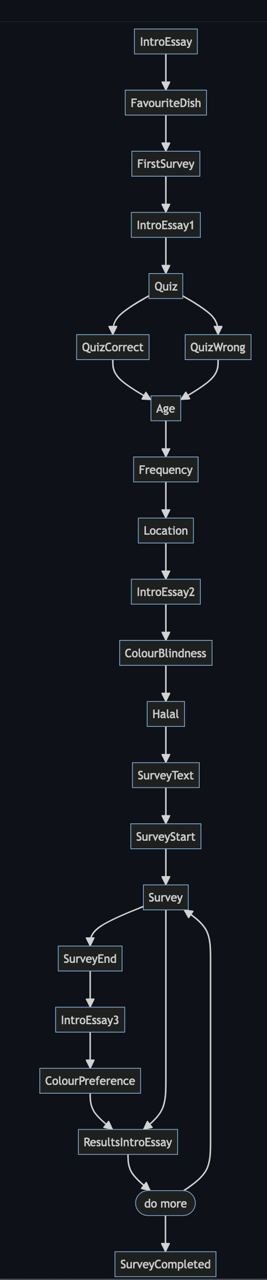
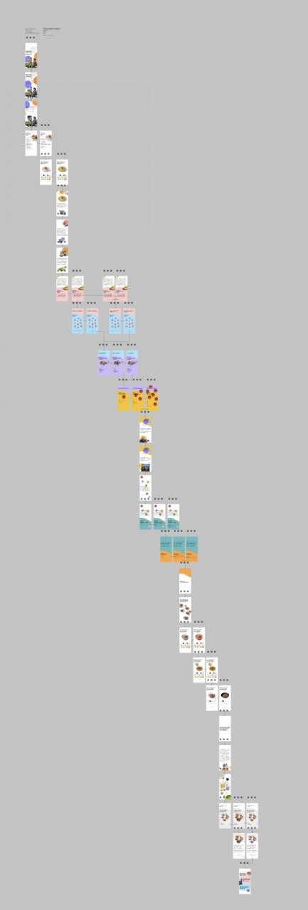
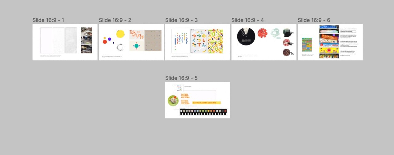
It started in my notebook, figuring out how you’d pick a colour for a dish with one thumb: swipe a palette around the food, or tap through a ring of colours. Then came the moodboards, and then screen after screen in Figma. The final flow goes intro essay → favourite dish → a quiz → a few questions about you → the colour-matching loop → your results.
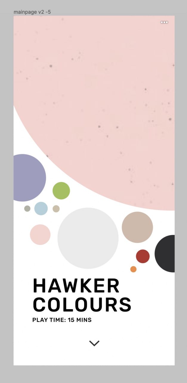
What we built
hawkercolours.com only works on your phone. Open it on a laptop and it just shows you a QR code, cus that’s how you’d be using it at a hawker centre anyway.
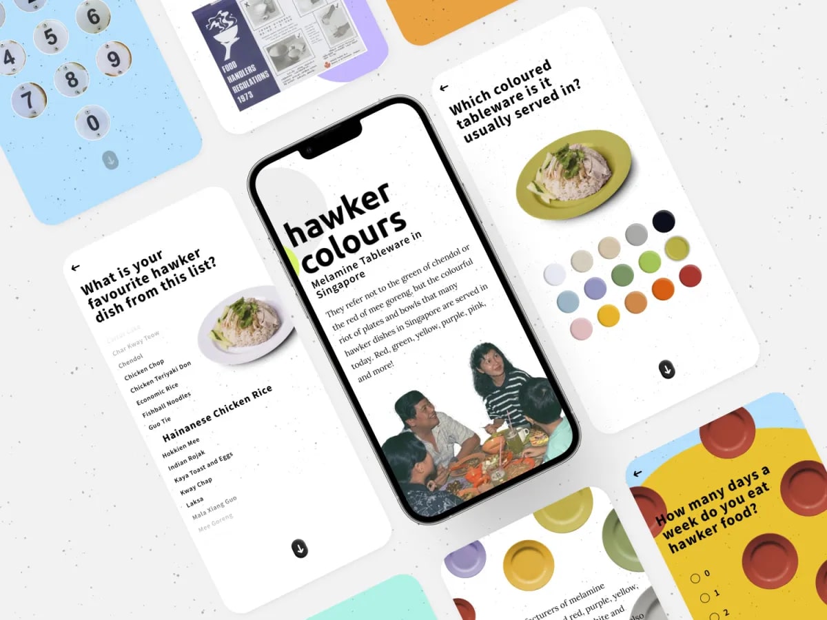
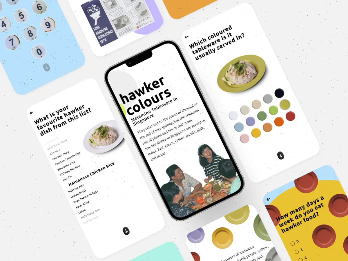
You start by picking your favourite dish off a wheel (bak chor mee all the way to yong tau foo), say which colour it’s usually served on, and take a little quiz on what colours hawkers were using back in the 1970s.
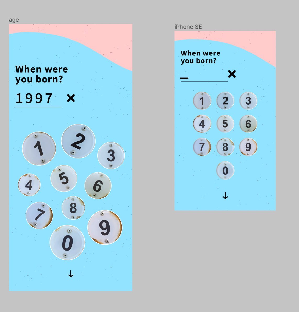
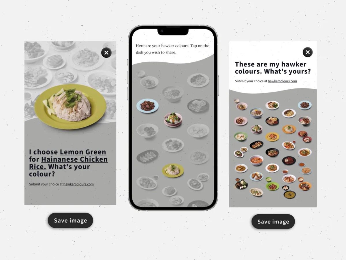
Then a few questions about you, all built out of hawker things: your birth year goes in on a keypad of table number plates, and you tap the parts of Singapore you eat around on a map. After that comes the main event, going through the dishes one by one and choosing the plate colour each one belongs on.
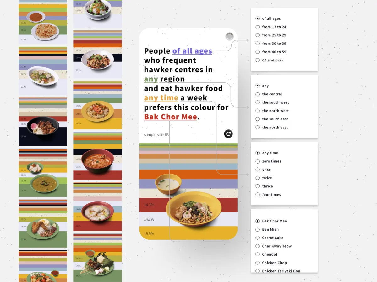
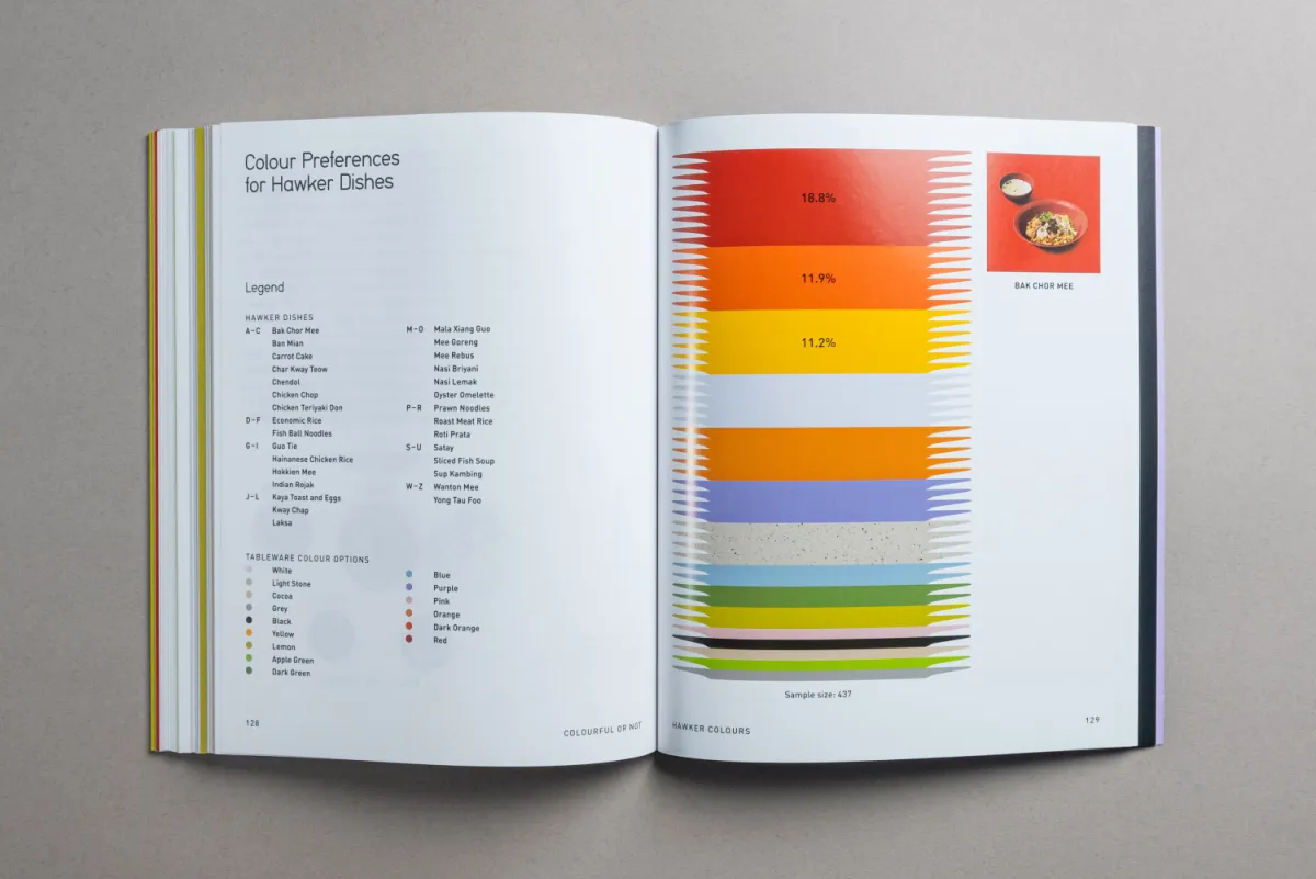
At the end, the results page shows how your answers stack up against everyone else’s, filtered by dish, age, region and how often you eat out. You also get a card of your own hawker colours to share, and the home page fills in your palette as you go.
Under the hood: Next.js, Mantine for the UI, tRPC for the API, and NextAuth so you can sign in with Google or just go in as a guest.
The stories
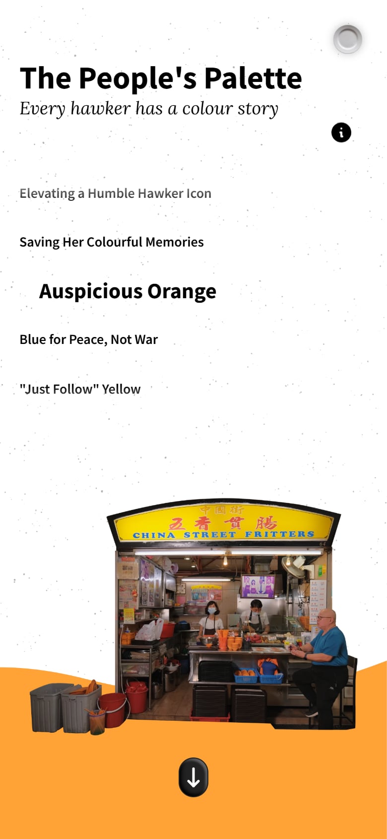
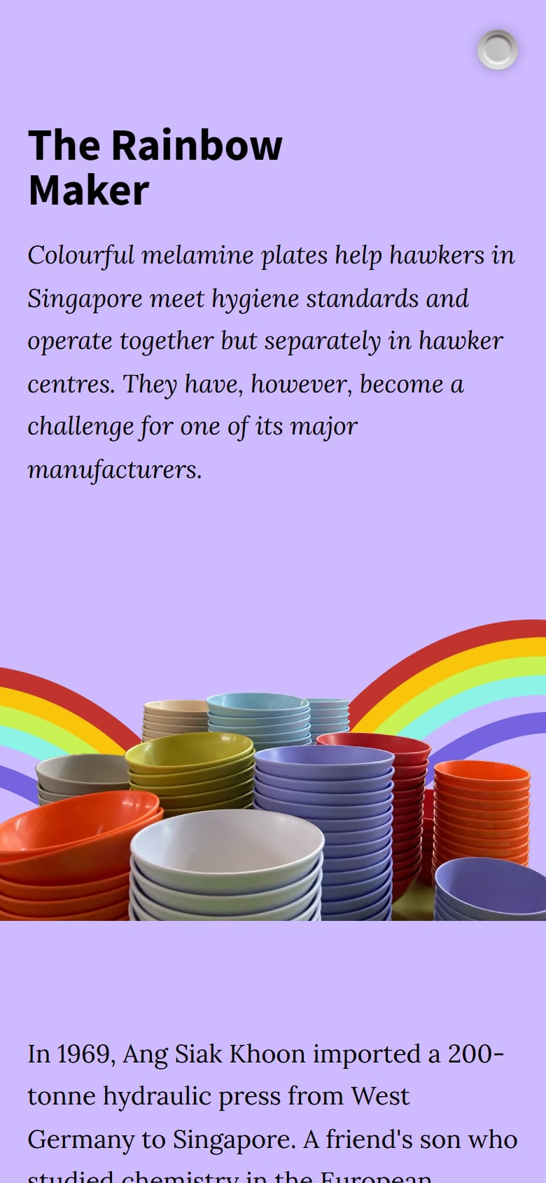
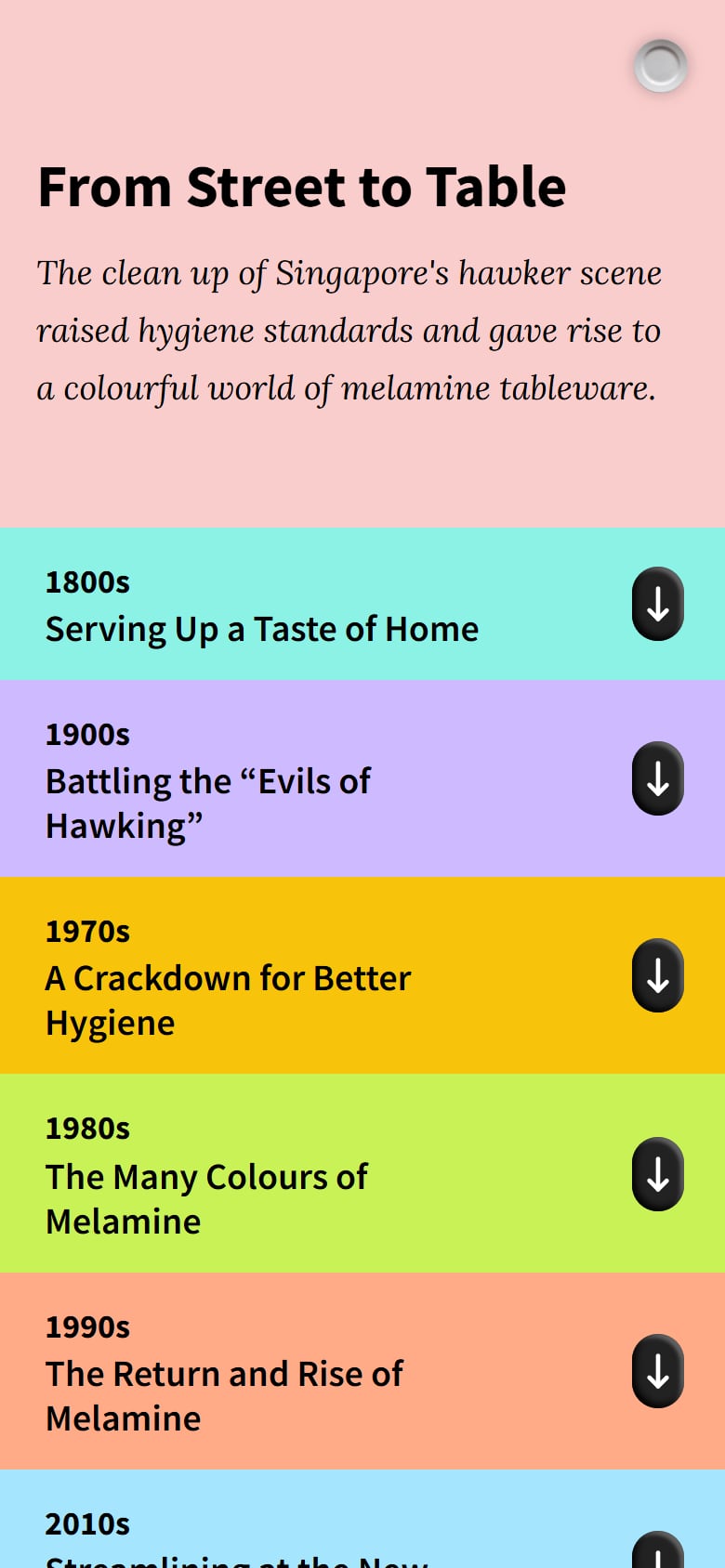
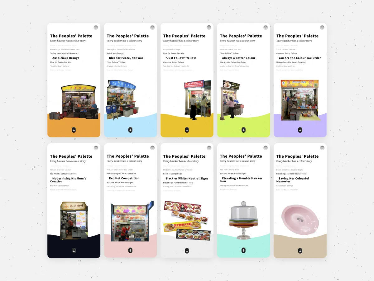
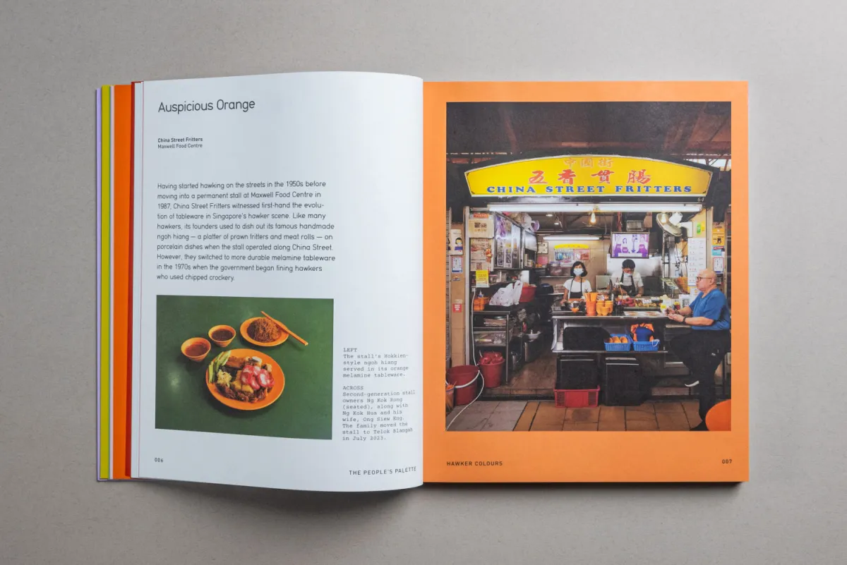
Around the survey are four stories written by In Plain Words, so you get the why along with the what. The People’s Palette goes into the colour stories behind individual stalls, The Rainbow Maker visits the local factory that makes the melamine, From Street to Table traces how melamine ended up in hawker culture at all, and A Colour-less Future looks at what centralised dishwashing means for all of it.
What Singapore said
| 1,400+ | people answered the survey |
| 77% | preferred their hawker food on colourful tableware |
| 30 | hawker dishes in the survey |
| 4 | stories on the site |
| 175 | pages in the book that came out of it |
So yeah, turns out we weren’t just being sentimental.
The book
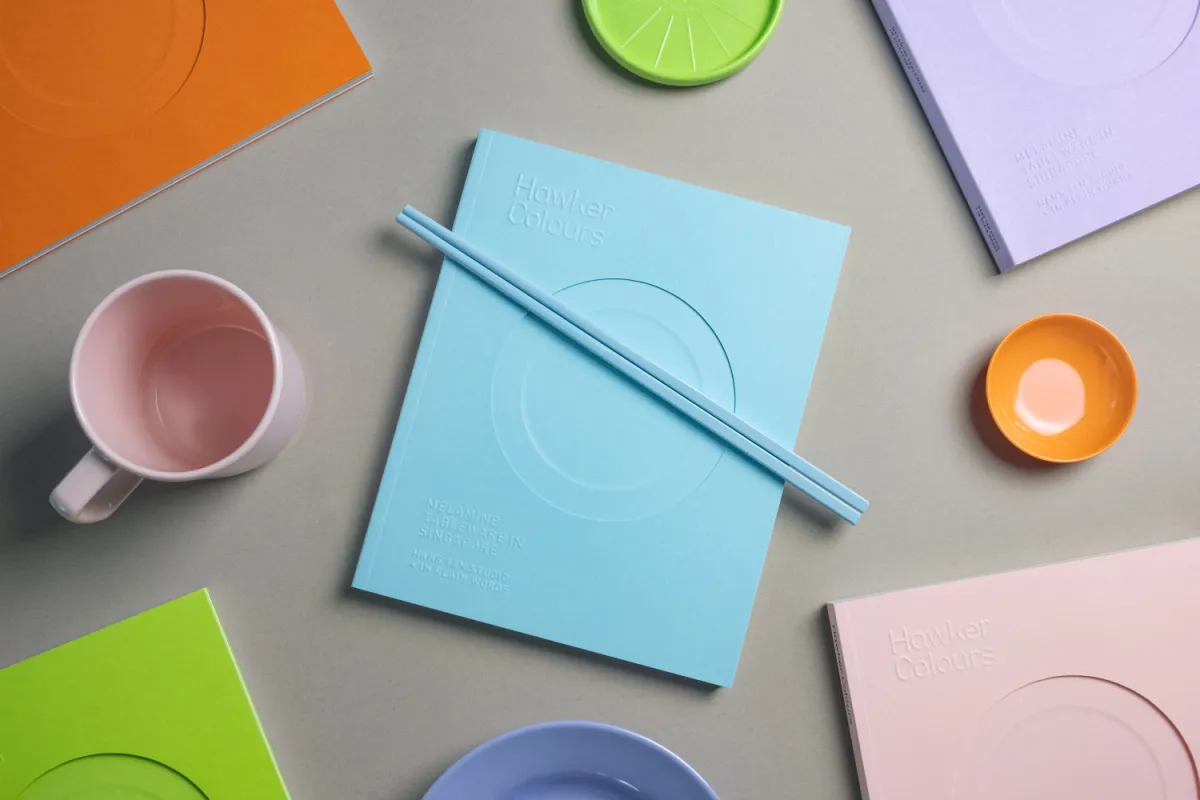
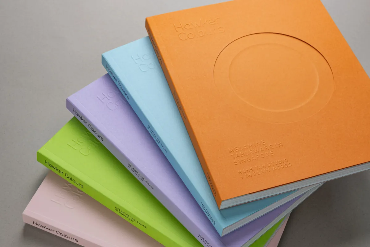
The survey data went on to become a book, Hawker Colours: Melamine Tableware in Singapore, published by In Plain Words with Hans Tan Studio in December 2023 and designed by Currency. It comes in the actual plate colours, has a die-cut cover shaped like a plate, and got a reprint in 2026.
Into the Singapore History Gallery
And now it’s going into a museum. The Singapore History Gallery at the National Museum of Singapore reopens on 10 October 2026 after its first full revamp, and its hawker section includes what Little Day Out describes as “a trivia version of the Hawker Colours project”, where you interact with dishes to uncover their origins.
Something two design students hacked together while learning React, sitting in the gallery that tells Singapore’s story. Still processing that one tbh.
Where it all started
My ability to build and create web experiences really, really links back to the starting point of this project. It’s where I went from vanilla JS to React, and from making websites for myself to shipping something over a thousand people actually used. Crazy undertaking.
Out in the wild
| Apr 2022 | DesignSingapore Council | Good Design Research grant recipients |
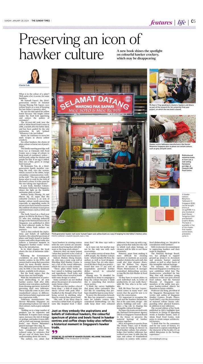
| Jan 2024 | The Straits Times | Rainbow connection: preserving the colourful melamine bowls and plates of hawker centres (in print as "Preserving an icon of hawker culture") |
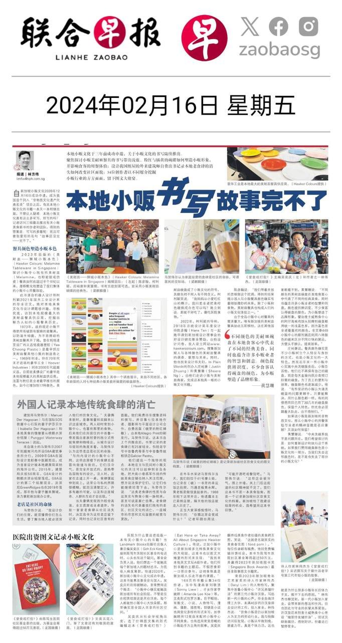
| Feb 2024 | Lianhe Zaobao | 本地小贩书写故事完不了 |
| May 2024 | art4d | Hawker Colours: Melamine Tableware in Singapore |
| Sep 2026 | Little Day Out | Guide to the revamped Singapore History Gallery |
my role
- Development
special thanks